Spark by jyant@jyant.inseeders: 4
leechers: 0
Spark by jyant@jyant.in (Size: 335.13 KB)
Description
Spark Simple and Effective Corporate Website - available on differt sites with lic. starting from 25$$$ here for free
http://jyant.in Spark is a fully responsive one-page HTML5 website template. It makes use of the newest features available today via progressive enhancements, and it assures enterprise-level compatibility with all browsers, tablets, phones and offers graceful degradation for older browsers. The layout is based on the 960 Grid System (via Skeleton), it is very easy to use and adapt to your needs. Clear documentation is provided with simple examples. The slider is as-well fully responsive and integrate beautifully with the layout, if offers hardware-accelerated CSS3 transitions with standard javascript fallback for the few unsupported browsers/devices. There are 3 color variations: Contrasted Black White Here is another example featuring more columns for the Pricing section: Content Enterprise-Level Features The concept of this one-page website template is to provide a great experience going from one virtual-page to another, while keeping all the benefits of separate pages (accessibility, browser history, bookmarkable URLs, SEO , and more). The other great implementation of this design is the flexible, responsive layout. With one website you actually get 3-4 specific layouts for desktops, tablets, phones, and any other devices: The layout adapts itself to what the browser is capable of displaying. by jyant jyant@jyant.in 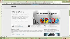 Sharing Widget |