The Enschedé Font Foundry (TEFF) | Renard Collection 21×OTF € 1909,00seeders: 5
leechers: 1
The Enschedé Font Foundry (TEFF) | Renard Collection 21×OTF € 1909,00 (Size: 555.03 KB)
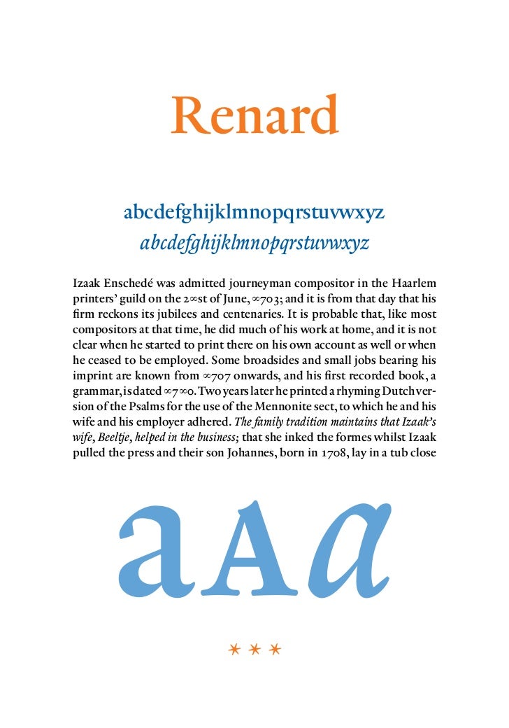
Description  Renard was designed in 1992 by Fred Smeijers, the renowned Dutch typographer and designer of various typefaces like FF Quadraat. Renard is an interpretation of a 2-line Double Pica Roman (Gros Canon) cut by the Flemisch punchcutter Hendrik van den Keere around 1570, and shown in Plantin's folio specimen of c.1585. Van den Keere's typeface was cut in a large size for display setting: for use in choirbooks for example. Such a book would be placed in front of the choir, so it had to be legible for all the singers in poor lighting conditions. To achieve legibility the typeface is rather condensed, with a large x-height and dark overall colour. Van den Keere never cut a complete italic, so Renard's italic is a new design, made in the spirit of the period. Fred Smeijers writes about his design: "Renard belongs to the broad category of Garamonds but occupies a unique place among them. The roman descends - unlike some other Garamonds - from a clearly traceable historical origin. In other words: it's from a good pedigree with decent papers. Next to that it's the only Garamond which can rightfully claim to be 'Flemish'. Not only because of its roots, but certainly due to its almost Breughelian features. Which is something that's lacking not only in competitive revivals, but in any other Garamond." In a departure from contemporary thinking about type families, Renard is limited in its range of style variants. There is no 'bold'. Instead, there are two lighter weights: Renard No2 and Renard No3. Renard No2 is intended to complement Renard No1 for use in headings. Renard No3 can serve as a definite 'light' variant with Renard No1. All variants have small capitals, old style figures, related italics and various ligatures. http://www.teff.nl/fonts/renard/                     /// Related Torrents
Sharing Widget |